The mission of Macomb Community Action is to serve those who do not have adequate access to basic necessities such as food, utilities, education, and housing. Their goal is to connect at-risk community members with necessities that promote financial independence and ensure that they are set up for a successful future. MCA and its four core services (Nutrition, Senior, Family, and General Information) act as a resource for those who are looking to better their current situation and contribute to a community that cares for its members. I was tasked with unifying the program's brand identity, in an effort to make MCA's resources more readily available to the community.
Icons for Nutrition Services, Family Services, General Information, and Senior Services
The biggest pain point for MCA's customer base was their lack of brand clarity. Being that MCA is an outreach program comprised of four main services, it is imperative that they were each given an identity, while still being unified with the program as a whole. Themes of equity, stability, and clarity are paramount to MCA’s mission. That being said, these themes are visualized by simple, rounded shapes and calming, innocuous colors.


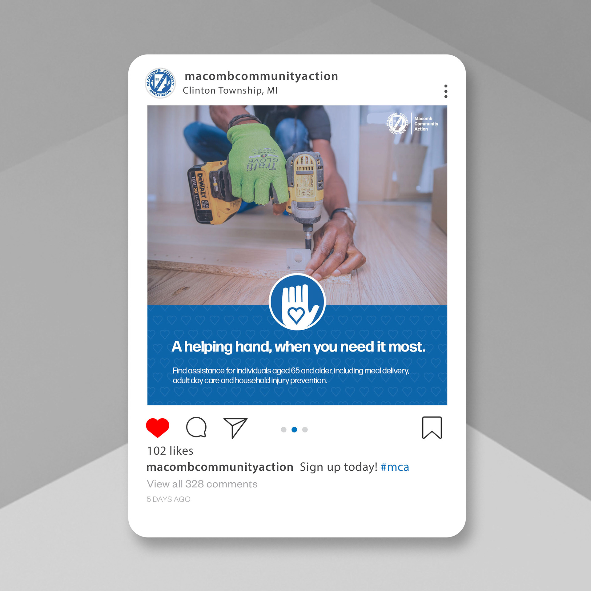
Another pain point was MCA's lack of cohesive online presence. With a unified brand identity, as well as a strong visual form to represent each service, customers are able to identify what service they need and the outlets in which they can access them, all at a glance.
Direct mail flyers promoting MCA's Family and Nutrition services
Double-sided pamphlet offering information about MCA's Home Injury Prevention Program, which installs safety railing and home improvements in elderly resident's homes
Printed collateral was another area in which MCA had room to thrive, being that a large portion of their customer base are older folks. By utilizing MCA's service icons throughout, brand recognition is enforced further.
